Where is the centre of the world? Or should that be… where is the centre of your world? Mapmakers have faced this problem for as long as there have been world maps.
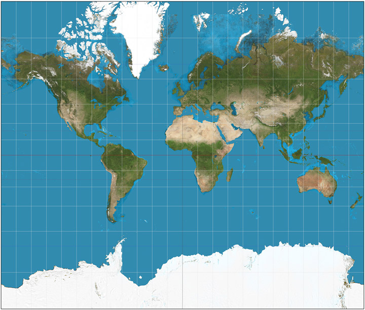
The map you are probably most used to seeing is a Mercator projection with Western Europe right in the middle.
Created in 1569, the Mercator Map was used by sailors to navigate the world’s oceans. But Gerardus Mercator faced the problem of projecting a sphere onto a rectangular map.
The result is a map that massively overstates the size of the lands nearer the Earth’s poles in comparison to the countries near the Equator. This has the effect of squashing India to the length of Finland and expanding Greenland to the size of Latin America.
The effect is clearer on a modern Mercator projection:
Africa is much bigger than it looks on a Mercator map: you could actually fit the continental U.S., China, Western Europe, India and Argentina into the African continent and still have lots of room left over.
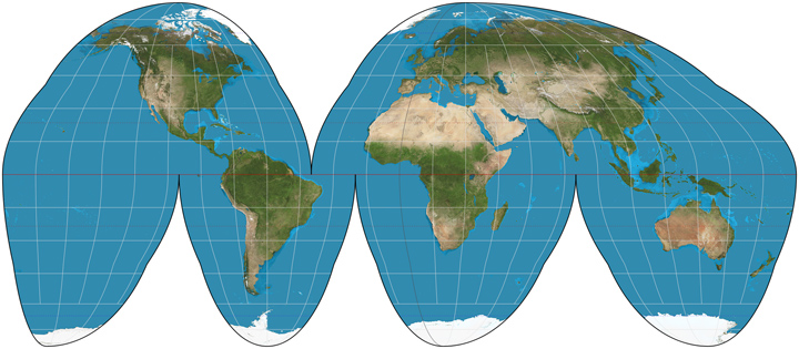
Nobody has ever claimed that the Mercator map is a perfect representation of the world, but the challenge of mapping the world remains. Many cartographers have tried to produce a rectangular map that better represents the size of the world’s landmass, but they usually look a little… well… weird. Here is an example from Behrmann:
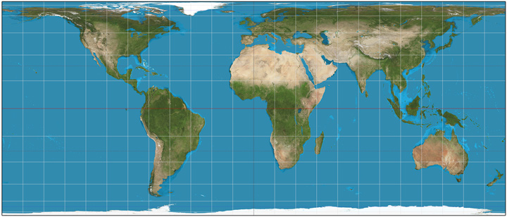
The countries nearer to the poles end up squashed, so although it does represent the size of the countries more accurately, this kind of map is hardly more accurate than the traditional Mercator projection.
For much of the nineteenth and twentieth centuries, atlases preferred to use cylindrical or pseudocylindrical maps to show the world, as they reduced some of the problems of distortion:
Yet all of these maps have one thing in common: Western Europe is in the middle. In some ways, this makes sense. Navigators would usually navigate to or from Europe. The Greenwich Meridian was, and still is, the zero point for world time.
This zero meridian is a human creation and could just as easily run through Brazil or China… but Europe was the centre of the world when the world was mapped.
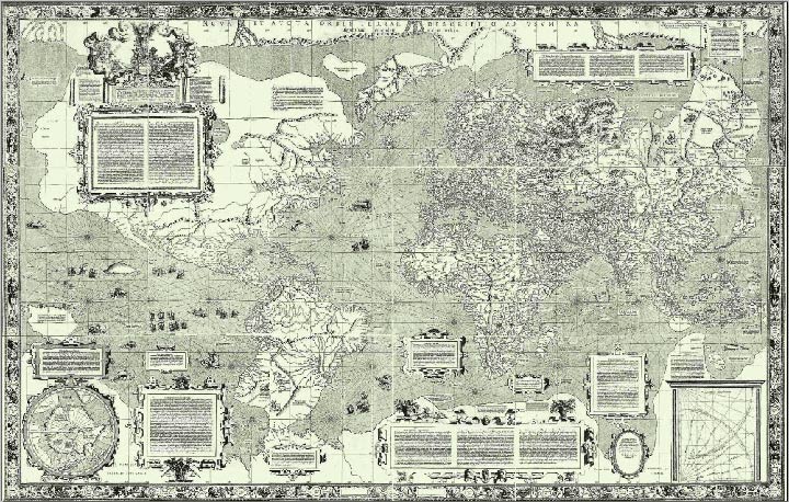
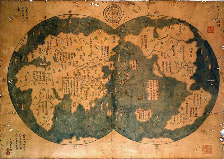
This Chinese map from 1418 depicts a world with China in the middle:
A modern map with this centre would actually be more democratic, considering most of the world’s population live near the middle of the map.
And here is an Australian map from the 1970s. This one was a cheeky riposte to the accepted European worldview:
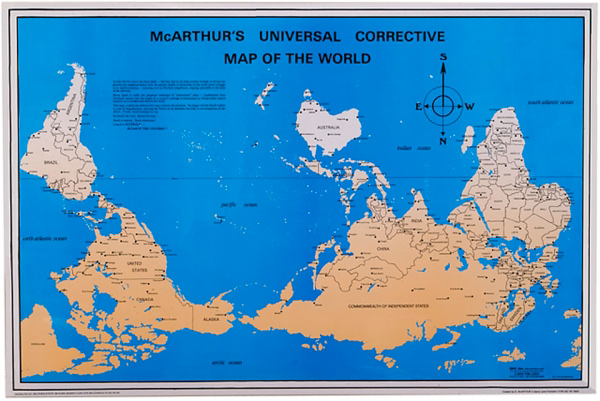
Weird, right? But north is only “up” because tradition says so. South could just as easily be “up”. Al Jazeera wrote about this here.
Scientists believe that the world’s magnetic poles are currently in the process of switching around, so within a few thousand years, south really will be north.
This will be a big problem for birds, bees and other animals that use the world’s magnetic fields to navigate, but humans should be able to get on with business as usual.
Which all goes to show, perception and reality are not as closely linked as we like to think. If north can be south and Finland can be longer than India, it is important to get out there, see the world and come to your own conclusions.
And if you come up with a solution for how to present the world as a rectangle, please share your idea!
Check out some fun ways of visualising the world here.
Images: Wikimedia Commons, Flickr